Thursday 26 April 2012

Final Idea


Ideas on Storyboard of Journey With Students


Brainstorm on Theme: Journey+Student


Looking at another film on  4 3 2 1  whose director by english actor and screenwriter. The reason I've chosen this film to analyse the interesting structure of storyline which also link on theme of ' Journey'. Basically, the story is about thriller following three days in lives of four best friends. Whilst Jo is tired down to a dead end supermarket job, and all her friends are all out on their own separate adventures. From the scene where all friends are all out separate adventures, there is interesting structure of storyline that explained each four girl's adventures to link the flashback of what's happening at the beginning.

To research more film, Sin a lot whose director is Frank Millers an american comic book artist. He's also, well known for his dark films, noir-style and comic book & film.  looking at the structure of Neo-noir and how it revolutionised today's society from back in 1940s-50s. However, Frank's work on 'Sin City' used a lot of noir which also includes its use of shadow and stark backgrounds. I also like how Frank uses black & white with the exception of red mostly yellow and blue which also draws attention to certain character in the story.

Research More on films..


http://www.youtube.co./watch?v=a-L1L2EItro

A clip of nike football commercial advert. What i like about this advert is the way camera shot are view from player's eyes and the storyline is about player's life as routine and how the player reach his next level to achieve his dream. Very creative idea. What I'm looking for, in this advert is to give me a ideas of method on how to use different style of camera shot during the journey.

Research on Films...

To research on film, looking at the structure of storyline that link to this project on 'Journey'. Consider, the structure of camera-shot. For example, looking at film on  'Scott Pilgrim vs The world' looking at the comic style and how it was use in this film. considering  to use comic styles on my short-film Promote Graphic Communication?
Far-right-middle as you see a quick sketch ideas on using comic style.

To Promote Graphic Communication in a vibrant and energetic way using time-based media.

(Assignment 4)
To have established Key brand values for our Graphic Communication course.  Will need to apply these values to a screen-based solution.


Choose from the following:

1.Produce a one minute stop-motion Flash sequence of carefully photographed and presented images, to be accompanied by suitable soundtrack.
screen size: 1280x1024px
Frame rate: 15fps
Software: Flash CS3

2. Produce a one minute video sequence focussing on one aspect of the course (see below), to be accompanied by a suitable soundtrack.
Produced in FCE
Submitted as a Quicktime Movie.

3.Produce a one minute web-based advert for the course, in the style of a viral, with appropriate use of sound.
Submitted as a Quicktime Movie.

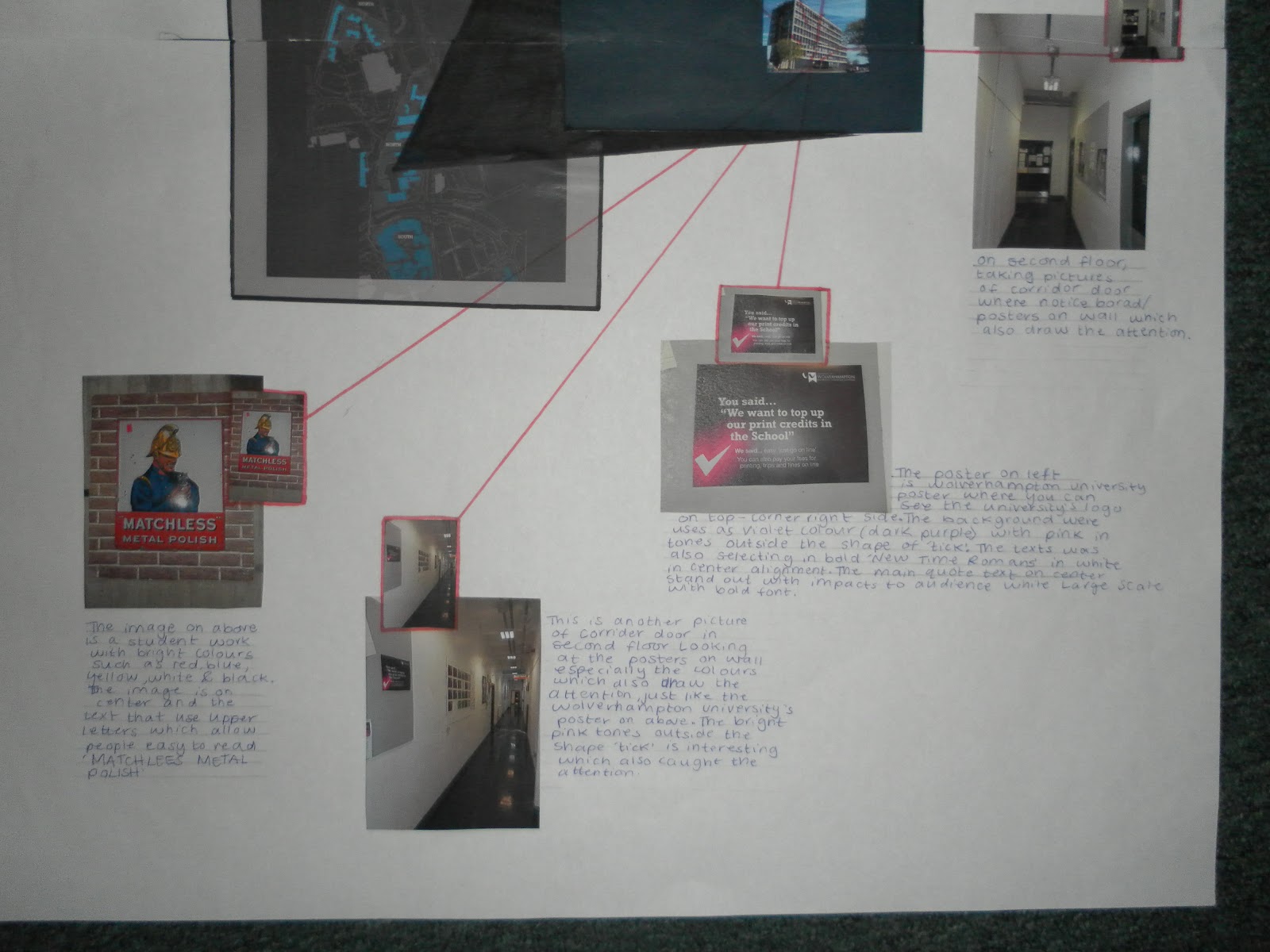
The images should create a visual narrative about an aspect of course;
-A journey around floors 2/3
-Our Students
-Success/empoloyability/alumni/placements
or another category as agreed with tutors.

Must include the following:
BA [Hons] Graphic Communication
University of Wolverhampton


The University Logo


An inspiring quote about the creative process and reference it.

Final 3 ideas of Poster..

                                           
                                           Idea (1)                                Idea (2)

                     
                                          Idea (3)  the red spot shows that idea (3) is my final idea on poster...

Development ideas, on posters...


2-page brainstorm..


To visiting MK building at University of Wolverhampton and take pictures of Student's work, inspirational posters in MK building. Which also help me to create ideas for my final piece, linked the subject of Graphic communication and consider how to promote about Graphic Communication course.

More Inspirational collage artist- Jan Tschichold

The image of Jan Tschichold's work (far-top-left) and looking at the structure of his compections included imagery, typeface, text and colours on this poster. I've noticed that on this poster the artist uses alot space with various shapes in this piece of work. While there is spaces, Jan put bold large scale of 'Aril' which also caught the attention. The texts is selecting on right-alignment.

Looking at Inspirational 'Collage' artists


The image on the bottom-left, as you see is Kurt Schwitter's design. I like the way he uses the scale in mixing objects/people which i find interesting. However, this design is called "Mouth open" to see what goes on in man's mind to see his imagination.

More Inspirational typography artists..Jamie Reid

Jamie Reid is well know in using font in collages in which he also focuses more on type as funcitional in environments as well. However, what i like about this pop art is 'Britain's flag', (middle-left) were it is torn up where the texts of collage are positioned in the center fonts on collage was interesting. which he did differently from other graphic designers. The colours that are in the image are Black, White (background) red and blue (britain flag colour).

Analyse David Carson's work

Research  David carson's work and the picture (middle-left) of the face on texts with tones and the colours that are used such as; Black (background) light purple (light tone), dark purple (dark tone). The typeface that is used is various typefaces in this piece of work. I like how David used the face as texts with colours looking like photography.

Looking at inspirational typography on artists. for example, Neville Brody and i like how he uses the structure of composition by selecting the text's position in the horizontal & vertical (top-left)

What Is Poster?

To brainstorm what is poster and looking at specific areas, such as; Diversity, Media-screen based print based, Dedication, freedom, engaging, collaboration, research-development/ideas, supportive, friendly, employability, creative etc.

Wednesday 25 April 2012

Shout it out! Graphic Communication at the University of Wolverhampton

Focussing on creativity-promote the Graphic Communication course via a large format, monochromatic poster. Dazzle, amaze explain or challenge...
(Assignment 3)
The graphic communication course is structured to reflect industry practice and offers study options in print and screen media that reflect this diversity. we encourage a positive but critical engagement with both the design industry and society at large. students on the course evolve into thinking practitioners; their practice is informed by a broad range of discourses, which include art and design history, aesthetics, semiotics, representation, deconstruction and ecological, ethical and social issues.


The poster should be oriented as portrait and printed out/presented at A3 [297x420mm]. The poster should be designed to work in greyscale only. However this doesn't rule out the later option of adding colour by careful choice of paper stock, or by manually adding colour to final large scale poster using paint, old teabags, collage etc. Must include the words BA [Hons] Graphic Communication and also use the university logo supplied on WOLF. Other text to include is as follows  School of Art & Design. University of Wolverhampton. City Campus North, Molineux Street, Wolverhampton. WV1 1DT. E: art-design@wlv.ac.uk T:08009533222

Thursday 12 January 2012

Final Piece


devolping the ideas of packagings

This is devolping idea form (2) on the left side, which I've also mock up the model, as the result went okay, could have done better.


devloping ideas (3), the idea was inspirsed from ANTA's work and made this mock up model which is sccussful. however, willing use this final idea. consider box to put this 3Dmailer safely when posting.


The image on above, as you see picture of a quick sketch net box, showing how the structure of this mock up model works. On the right side which also is final idea.

Continue devloping ideas of pagckagings...


On the right side, as you see devloping ideas (2) which also made a mock up model and here are images below of model;


This model wasen't succussful as the net box was complicated to mock up this model at same time good to experiment.

devolping the ideas of packagings


The image on the right as you see picture of sketch packagings, ive made mock up model which wasent successful. Continue experienent various structure on mock up model

Here Picture of Mock up model below;


Different angle's shot.

Continue researching on 3D Mailer..


Come to the City.Updating the image of wolverhampton.

Assignment (2)
Using My logo and brand palette for the city of wolverhampton, should formulate a dynamic mailer that will promote the city as a destination.It should base this dynamic mailer on my visual design language and it should reflect the city as a brand. considersing pop up structure, maybe it;s an inflatable or could it be a package containing a lovely gift or enticement?


The website on above, is looking at this advanced packaging as pentagons. to make this slide geometricconstructions put together pentagon needed 12 copies.

A bit changes on Wolverhampton Brand..


After received a feedback from assignment (1) the logo need a change as the 'heart' before letter 'W' looks more complicated. However, I'm going to change little bit to get rid of 'heart'. Willing to put full normal typeface as ' Misrlou' afterward, making it in a better version by designing typeface on illustrator.